12
$\begingroup$

Another one of the 7 essential meta questions- what should our logo look like?

Edit: This was originally a discussion both about the logo and about the theme, but now the theme has a separate discussion.

$\endgroup$
11
  • 4
    $\begingroup$ Let's wait until we have chosen our domain name? $\endgroup$ Commented Aug 17, 2010 at 21:18
  • 1
    $\begingroup$ Does the colour scheme really have much to do with the name? $\endgroup$
    – Greg
    Commented Aug 18, 2010 at 3:18
  • $\begingroup$ To give an example: if we choose a name like tcsoracle.com, it might be a very good idea to not choose a red-and-white colour scheme. :) $\endgroup$ Commented Aug 18, 2010 at 9:43
  • 1
    $\begingroup$ Why ? I'm missing the joke here $\endgroup$ Commented Aug 23, 2010 at 4:48
  • 1
    $\begingroup$ Cf. oracle.com. $\endgroup$ Commented Aug 23, 2010 at 8:07
  • $\begingroup$ I second Jukka Suomela’s comment. If the domain name is CSTheory.org (current top votes), the logo and design can be anything as Greg suggests. That is exactly what I think is the weak point of the name: it is merely a domain name and does not serve as a theme. If the domain name is e.g. tcscafe.com (excuse me for using my own suggestion as an example), the design including the color scheme can and should be consistent with the theme determined by the name. $\endgroup$ Commented Sep 5, 2010 at 18:20
  • 1
    $\begingroup$ I'd like to break this question into two parts: the logo design and the theme design. While I don't deny that they are related, they are different enough that it's ok to separate out the threads. Thoughts ? $\endgroup$
    – Suresh Venkat Mod
    Commented Sep 13, 2010 at 16:51
  • $\begingroup$ Sure, splitting sounds fine. We could have a logo design contest for the logo. $\endgroup$ Commented Sep 14, 2010 at 15:50
  • $\begingroup$ I agree to Suresh about breaking the discussion into two parts. Considering that most answers given here are about logo, I guess that a discussion about theme can go to a separate page. Can anyone edit this question and make another discussion for theme? (I cannot do the former because of rep hurdle.) @Suresh, can you do that? $\endgroup$ Commented Sep 25, 2010 at 18:05
  • $\begingroup$ You can merely create a new question for the theme, and I can edit this one to reflect that. $\endgroup$
    – Suresh Venkat Mod
    Commented Sep 25, 2010 at 18:43
  • $\begingroup$ @Suresh: Done. It took 2 days to realize your comment, and meanwhile I seem to have gained enough rep to edit a post. $\endgroup$ Commented Sep 27, 2010 at 19:47

13 Answers 13

19
$\begingroup$

How about a DFA with 2 states, one labeled "confusion" (or something like that) and the other being a final state labeled "clarity" or "solution" (or something to that effect), and the DFA has only one transition, from confusion to solution, and on the transition arc we write "cstheory.org" in a large font.

$\endgroup$
7
  • 9
    $\begingroup$ How about labeling the states Q and A? Nice, simple symbols but with an obvious meta-interpretation. $\endgroup$
    – Kurt
    Commented Sep 14, 2010 at 23:53
  • $\begingroup$ Sure.. As my post indicates, I don't have good ideas for what the labels should be. Other suggestions are welcome. Q -> A looks good. $\endgroup$ Commented Sep 15, 2010 at 0:15
  • 16
    $\begingroup$ Q → A is fine, but another idea for labels is ? → !. $\endgroup$ Commented Sep 15, 2010 at 2:45
  • $\begingroup$ That's also a nice idea. $\endgroup$ Commented Sep 15, 2010 at 13:57
  • $\begingroup$ ? → ! is still meaningful even when rendered very small. Moreover, the dots in the two symbols hark back to the vertices in the state graph. It's a great idea! $\endgroup$ Commented Sep 18, 2010 at 14:18
  • 4
    $\begingroup$ there should be a loop on the first state $\endgroup$
    – RJK
    Commented Sep 27, 2010 at 20:49
  • $\begingroup$ One nice thing about ? → ! is that it is using symbols from linear logic (Theory B). So it would be a logo for both Theory A and Theory B. (? and ! are read as "Why not?" and "Of course!"). $\endgroup$
    – Kaveh
    Commented Oct 18, 2010 at 19:40
13
$\begingroup$

How do you like this one: http://students.mimuw.edu.pl/~ksoltys/tcs.gif ? When you draw this little line between sigma and the infinity symbol, you get a wind-up sigma ;) which I think is a nice symbol for TCS. I used this logo for TCS students' club in my department, but I think it wouldn't conflict.

sigma

edit: I made some changes: sigma is now grey and it has two gears instead of the infinity symbol. I didn't change the sigma's font: sans serif fonts deprive it of it's serious mathematical feel, and all serif ones I tried force it to be large (otherwise serifs overlap with the "t"). If someone knows some better font for the sigma, let me know, I will change it. You may also tweak the (GIMP) source: http://students.mimuw.edu.pl/~ksoltys/tcs2.xcf

grey

$\endgroup$
7
  • 1
    $\begingroup$ That's quite a cool logo. $\endgroup$ Commented Oct 2, 2010 at 17:13
  • 1
    $\begingroup$ I like it as well ! $\endgroup$
    – Suresh Venkat Mod
    Commented Oct 2, 2010 at 18:08
  • $\begingroup$ The idea is great: the symbols on the tape that fades out in both directions, the great big Sigma towering over the tape looking like an FSA. The wind-up infinity doesn't work for me: maybe better a Tex-style limit? The wind-up idea could be preserved by making the infinity out of cogs. $\endgroup$ Commented Oct 3, 2010 at 9:20
  • $\begingroup$ I like the idea. I think the big Sigma is a bit too dominant, though. I wonder if it would be possible to tweak the design so that the Sigma was smaller in comparison with the tape? (You might need to use a different font for Sigma.) $\endgroup$ Commented Oct 3, 2010 at 9:44
  • $\begingroup$ And a related issue: It's a bit too easy to read it like "Σtcs" instead of "<some decoration> tcs". Using grey instead of black for the big sigma might help; then the "tcs" text would stand out? $\endgroup$ Commented Oct 3, 2010 at 9:47
  • 1
    $\begingroup$ I think the logo has to fit in a very small space at the top left corner of the website. See MO's logo for example. So it might have to be scaled down a lot. Also, shouldn't our logo contain our name, cstheory? $\endgroup$ Commented Oct 3, 2010 at 15:56
  • $\begingroup$ It looks ok (to me) scaled down on a page (you can see it here: kni.wikidot.com - here it's just a little bit bigger than the MO's one). I could make the tape longer to contain "cstheory". $\endgroup$ Commented Oct 3, 2010 at 16:57
8
$\begingroup$

Why not a Turing Machine? Something like

http://tiny.cc/4az4q

with the site name written on the tape and something depicting a group of people or a man on his computer inside the head of the TM

$\endgroup$
1
  • 1
    $\begingroup$ i like this idea $\endgroup$
    – Suresh Venkat Mod
    Commented Sep 14, 2010 at 18:49
6
$\begingroup$

Some suggestions for logos:

Of course, we'd have to ask the artist's permission to use any of these.

$\endgroup$
10
  • 2
    $\begingroup$ I like Stolfi's and Dunne's drawings. Not sure how well they work as a logo, though. $\endgroup$ Commented Sep 14, 2010 at 21:53
  • $\begingroup$ Surely the tape in Dunne's picture could be changed to contain the site name. $\endgroup$ Commented Sep 15, 2010 at 0:45
  • $\begingroup$ This is a very workable collection. $\endgroup$
    – Suresh Venkat Mod
    Commented Sep 15, 2010 at 1:25
  • 2
    $\begingroup$ Can we ask Randall Munroe to design something specially for the site? $\endgroup$
    – Kaveh
    Commented Sep 15, 2010 at 6:07
  • $\begingroup$ Of course we can ask him :) - but who knows him ? and is he aware of this site at all ? $\endgroup$
    – Suresh Venkat Mod
    Commented Sep 15, 2010 at 6:46
  • 3
    $\begingroup$ He visited UIUC a couple of years ago. I'd be happy to ask him. $\endgroup$
    – Jeffε
    Commented Sep 16, 2010 at 1:19
  • $\begingroup$ +1 for Mr Munroe $\endgroup$
    – Ryan Williams Mod
    Commented Sep 18, 2010 at 2:05
  • 3
    $\begingroup$ Okay, I asked him. Let's see if he bites. $\endgroup$
    – Jeffε
    Commented Sep 18, 2010 at 6:07
  • 2
    $\begingroup$ No response from Randall Munroe. Can't say I'm surprised. $\endgroup$
    – Jeffε
    Commented Sep 25, 2010 at 22:43
  • $\begingroup$ Tsuyoshi's ? -> ! suggestion is definitely in the spirit of xkcd. $\endgroup$ Commented Sep 28, 2010 at 17:39
5
$\begingroup$

Proposal 1 (following Jukka's comment)

Proposal 2 (following Kaveh's comment)

Proposal 3 (following Robin's comment)

Proposal 4 (following arnab's comment)

This last one is more sketchy. It now has some visual defects, but they can be easily removed.

$\endgroup$
13
  • 1
    $\begingroup$ Maybe that's a bit too big for a logo? It should fit in the little space we have at the top left corner. $\endgroup$ Commented Oct 18, 2010 at 17:01
  • $\begingroup$ @Robin: I can shrink it down to a reasonable size. Its simple graphics should allow it to be shrinked without loosing details. Here I've presented a bigger version just to give an idea. I wonder if people likes it or not. $\endgroup$ Commented Oct 18, 2010 at 18:48
  • $\begingroup$ @Robin: We could add some fade at the left and right ends of the tapes. Also, we may add some further graphics/symbols inside the big box. $\endgroup$ Commented Oct 18, 2010 at 18:51
  • 1
    $\begingroup$ I like the ?/! box. No need for the tapes. What if you just take a (scaled-down version, with thicker lines) of the ?/! box and added the text "cstheory" on its right side? $\endgroup$ Commented Oct 18, 2010 at 19:34
  • $\begingroup$ Nice job, but I found the simpler version (no Turing tapes, two states represented by signs ? and ! on the same level and just one arrow) more appealing. Not only it is a automata theory logo, it is also using signs from linear logic so also covers Theory B. $\endgroup$
    – Kaveh
    Commented Oct 18, 2010 at 19:35
  • $\begingroup$ agreed. ditch the tape... $\endgroup$
    – Suresh Venkat Mod
    Commented Oct 18, 2010 at 19:44
  • $\begingroup$ I agree with getting rid of the tapes too. Just one DFA with the word "cstheory" written over the transition arc from ? to ! would be cleaner and yet convey the same message. Also it would be smaller, and so would fit more easily. Maybe the ! state should be the accepting state of the DFA? (i.e., it should have a double circle instead of a single one) $\endgroup$ Commented Oct 18, 2010 at 19:49
  • $\begingroup$ Again, agreed with getting rid of the tapes. Also, maybe change the "!" to a lightbulb? $\endgroup$
    – arnab
    Commented Oct 18, 2010 at 23:19
  • $\begingroup$ I like this idea. Given the mechanics resp. use of the site, how about including an edge from answer to question? It happens quite regularly that answers create new questions. $\endgroup$
    – Raphael
    Commented Nov 29, 2010 at 8:35
  • $\begingroup$ @Raphael: Yes I agree with you. I can make a further proposal, adding a "feedback ring" (i.e. just an edge) to the question state. I'm also trying to imagine a less straightforward way to do that (i.e. how to give the same message in a more creative manner). $\endgroup$ Commented Nov 29, 2010 at 9:35
  • 1
    $\begingroup$ Maybe: $\{?,!\}^+$ $\endgroup$
    – Raphael
    Commented Dec 1, 2010 at 10:43
  • $\begingroup$ @Raphael: Cool ;-) I like that! But I'm wondering if these discussions here are still meaningful: isn't the site GUI now definitive? $\endgroup$ Commented Dec 2, 2010 at 13:57
  • $\begingroup$ If so then by arbitrary definition. Files can always be changed. $\endgroup$
    – Raphael
    Commented Dec 2, 2010 at 18:00
4
$\begingroup$

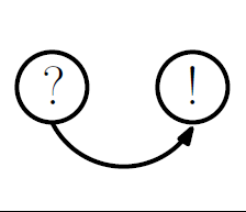
Another simpler (a little bit funny:) version of $? \rightarrow !$.
logo

$\endgroup$
2
  • $\begingroup$ Before we start designing logos, should we first find out if our logo will be used at all? As far as I can see, the logos of Cooking SE and Web Apps SE were not community designed. (Comments on the logo: Nice. Maybe it should also have "cstheory" somewhere? I always draw my transition arcs above the states, but I guess below works too.) $\endgroup$ Commented Oct 19, 2010 at 0:36
  • $\begingroup$ @Robin Kothari: It is fun even if they don't use them. (If I draw the arc above it won't look like a smiley! :) I agree that it would be much better if we can add cstheory to it (although I am not sure if overlords have accepted cstheory as our name). I played a little bit trying to add cstheory but didn't find a nice way to add it. Feel free to play with it. I can upload my Ipe source if you want, but it is very easy to draw this.) $\endgroup$
    – Kaveh
    Commented Oct 19, 2010 at 0:47
3
$\begingroup$

There is no "natural" depiction and design of theoretical computer science and of course it is a matter of taste. But looking at the popular branches of the field, automata theory could provide some simple and easy to recognize images: the name, decorated with circled states, connected via labeled transitions etc.

$\endgroup$
3
$\begingroup$

For the site icon (favicon.ico) the design has to be as simple as possible. We currently have "T/C" which doesn't mean anything. Of the above proposals "TCS" and "?→!" are the two that would seem to work for this specific design element.

$\endgroup$
2
$\begingroup$

I would recommend (in terms of colors and fonts) something similar to StackOverflow or MathOverflow.

$\endgroup$
2
$\begingroup$

What about this?

It's from the book Decision Procedures - An Algorithmic Point of View, so it's certainly copyrighted.

$\endgroup$
5
  • $\begingroup$ A little too big to fit in the header of a page. $\endgroup$ Commented Oct 11, 2010 at 15:36
  • 1
    $\begingroup$ @Tsuyoshi: Yes, yes it's too big. Its many details do not allow it to be shrinked down to a reasonable size. However, IMHO this picture is great. $\endgroup$ Commented Oct 12, 2010 at 7:29
  • $\begingroup$ One could put an image like that in the background, upper left (right) corner. But I do not think this is necessary. $\endgroup$
    – Raphael
    Commented Dec 2, 2010 at 9:31
  • $\begingroup$ @Raphael: Personally, I'd like to have images like this in the background (of course they should be much more transparent than this). But probably there are few people who agree with such opinion. Also, there would be a copyright issue. $\endgroup$ Commented Dec 2, 2010 at 13:53
  • $\begingroup$ Oh, I would not mind if there was a picture in the background, I just think it would not serve any purpose despite (hopefully) looking nice. Since we want to impress with content, not optics, we do not need one. $\endgroup$
    – Raphael
    Commented Dec 2, 2010 at 17:59
1
$\begingroup$

For the logo, should the text read CSTheory to match the domain name, or should it be spelled out as Computer Science Theory (or even Theoretical Computer Science)? Even though it would be less informative, I think I would lean toward CSTheory, as it is visually simpler. As for a graphic, I think Jakob's or chazisop's ideas would be nice. The logo text could actually appear as symbols on the TM tape. One consideration is that space is kind of tight in the logo, so it could be hard to do something too elaborate without it looking cluttered.

I find the color scheme on MathOverflow to be hard on my eyes; something a bit more subdued would be nice. Maybe someone has a colleague who works in human factors or graphic design and can help with the color choices?

As far as the other design elements go, the other main items are the backgrounds for the various buttons and tabs. I really like the fact that background image for the tag text on the beta site is an actual tag. It makes it immediately obvious what those are, and I think that's what good design ought to do. I think it's unfortunate that the other sites decided to discard that visual metaphor; I hope we keep it in some form.

$\endgroup$
3
  • $\begingroup$ I definitely think the logo text should read CSTheory to be consistent with the domain name. For a slightly more detailed description on the main page we could have some text analogous to MathOverflow's "Welcome to Math Overflow - A place for mathematicians to ask and answer questions." $\endgroup$
    – James King
    Commented Sep 14, 2010 at 20:20
  • $\begingroup$ I think we should consider using the spelling "cstheory" or "cstheory.org" instead of "CSTheory" in our logo. $\endgroup$ Commented Sep 14, 2010 at 20:35
  • $\begingroup$ I would prefer TCS or tcs. $\endgroup$
    – Kaveh
    Commented Sep 14, 2010 at 20:46
1
$\begingroup$

For logo, I suggest an illustration (or an idea for one) from Lewis Carrol's books about Alice.

Edit

Here is an idea: The disappearing Cheshire Cat, i.e. his eyes and teeth. ? and ! in the eyes, "cstheory" on his teeth, his leaps will look like the arrow in $? \rightarrow !$.

$\endgroup$
1
$\begingroup$

Here's a variation on the emerging consensus, with a little more razzmatazz. I'm also including the source tikz, so in particular someone can figure out how to raise the text a little higher. For some reason I was unable to convert the PDF to an image with enough resolution to display it inline

\usetikzlibrary{decorations.text}
\usetikzlibrary{arrows,automata,shadows}

\begin{tikzpicture}[scale=2.0,node distance=3cm]
  \tikzstyle{every state}=[shade=ball,ball color=white,draw=none,text=black,
                           circular drop shadow] % to get the shadow effect

  \filldraw [fill=gray!20!white] (-0.5,-0.5) rectangle (2,0.8);
  \node[state, ball color=black,text=white]      (s)   {$?$};
  \node[state]         (t) [right of=s] {$!$};

  \draw [->] (s) to [out=60,in=120] (t);
  \draw [decorate,decoration={text along path, text={\ \ \ \ \ \ \ cstheory}}] 
        [yshift=1in] (s) to [out=70,in=110] (t);
  \path (s) edge [loop above]  ();
\end{tikzpicture}

Note: version updated in response to comments (no loop, and cstheory raised slightly)

$\endgroup$
5
  • 1
    $\begingroup$ Very nice. The only suggestions I have are to make ? and ! a bit bigger so that they're readable when the image is small. Perhaps "cstheory" should be bigger? Or maybe it should be horizontal instead of curved. Not too sure about this, let's see what people think. $\endgroup$ Commented Oct 19, 2010 at 4:13
  • $\begingroup$ Nice job. I agree with Robin, ? and ! and cstheory a bit bigger. curved text is OK, just think it would look nicer if it does not touch the arc. And maybe the states should be a little bit closer to each other. $\endgroup$
    – Kaveh
    Commented Oct 19, 2010 at 6:43
  • $\begingroup$ And if we are going to have the other arc, maybe we should also add a label to it. (I prefer if it is not there, and there does not seem to be much support for it, RJK's comment above has only 4 votes compared to 14 votes for Tsuyoshi's comment about ? and !.) $\endgroup$
    – Kaveh
    Commented Oct 19, 2010 at 6:54
  • $\begingroup$ I can remove the arc, but I don't know how to move the text so it doesn't touch the arc. $\endgroup$
    – Suresh Venkat Mod
    Commented Oct 19, 2010 at 7:01
  • 1
    $\begingroup$ figure updated. no arc, and text was moved. $\endgroup$
    – Suresh Venkat Mod
    Commented Oct 19, 2010 at 14:19

You must log in to answer this question.

Not the answer you're looking for? Browse other questions tagged .